This article by Gary Burchell first appeared on the Abandon Ship game dev blog.
In this post we’re going to look at the step-by-step development of the logo for Abandon Ship, both in its current incarnation and our original logo, which very early fans of the game may remember! Bear in mind this blog is written by a game developer with no qualified marketing experience; I don’t claim to be a voice of authority on the subject so please treat this as a postmortem on our personal experiences.
A logo is such an important part of a product’s identity and is something we see in everyday life all the time. The big games publishers will either have their own departments that specialise in this field, or they will hire marketing firms to create a branding identity for them.
Small Indie teams of course do not have this luxury and have to rely on the talent of their team to deliver a compelling logo. Bearing in mind people dedicate their careers to logo development, this can present a tall order to artists attempting it in between making a game! This may have accounted for a crucial misstep I made in our very first logo.
Logo Research
We spent some time looking at other game logos and considering what we felt worked, and what didn’t. After collating some examples, it became obvious that good logos were generally clear and concise in their design. The name is usually very legible and is not obscured. Any iconography or other visual elements are secondary and are also very minimalistic.

Some logos can be extremely clever in their design. Evolve springs to mind with its use of the 4v1 layout that echoes the four small hunters versus one large monster.
The Brief
As with any concept-based work, the first step is a written brief that explains the key areas to tackle and be mindful of in the exploration. For us, those touchstones were Age-of-Sail Ships, the Oil-Painting Style, the Sea, a sense of age / history appropriate for the themes, key mechanics (such as abandoning ship and sea monsters) and a tonally appropriate vibe (i.e. a tough, dangerous world. This is not a jaunty pirate’s tale). Not all elements would make it into a final logo, but at such an early stage you cast the net wide.
Original Logo Development
With the brief in mind, this is the first couple of rounds of concepts:
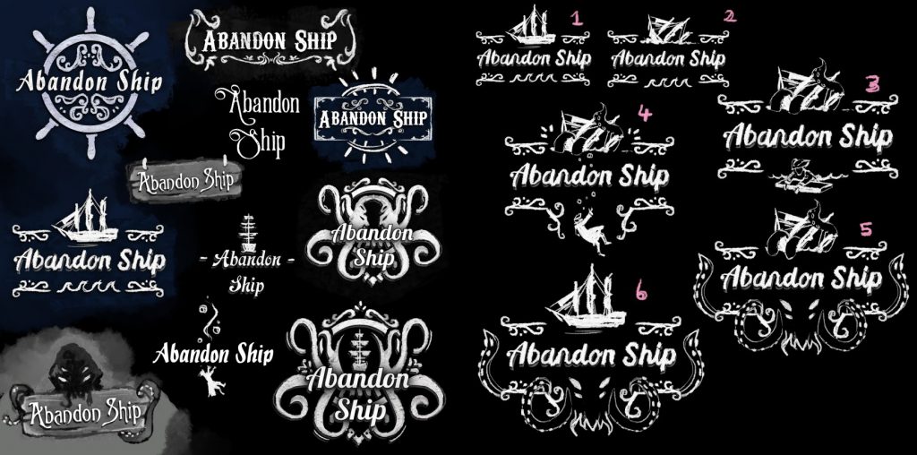
For those unfamiliar with the concept process, you always keep exploration work fast and loose. There’s no point spending too much time on concepts that get quickly discarded, so once the final elements come together, this is where you spend more time making a higher quality image.
As with any exploration, some elements were quickly discarded. The driftwood and Ships Wheel felt too out of place tonally; they had an almost “beach cafe” feel about them. The drowning Captain was interesting and we started to explore the idea of a ship in distress. At this point, we liked the more ornate aspects of the frames even though they were quite visually noisy. With the benefit of hindsight, I can see this is where my direction started to lead us down the wrong path!
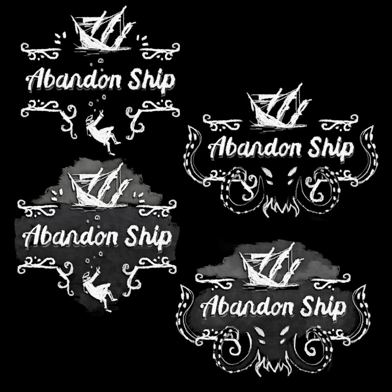
We started to focus in on the “ship in distress” idea and because we liked the drowning Captain, we moved the frame around to accommodate this extra element. We shied away from the Kraken and so discarded it. This is interesting because we would later come ’round to the Kraken in a big way!
As we honed in on the design we spent some time looking at fonts that felt appropriately ‘old yet contemporary’ and did a host of color variations, settling on a rich gold and blue scheme with “painted on canvas” texturing.
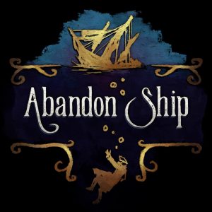
We felt this logo brought many of the ideas from the brief into one image. It’s easy to see now that there was too much crammed in, making it hard to read.
The logo was rolled out across our social media and website. At that point, while the game was “public” we weren’t pushing ourselves out there; if people discovered us so be it. It wasn’t until our Announcement Trailer was to be launched that we’d be contacting press for coverage, so we had time for the logo to bed in.
Without working on it constantly and with a little distance, the problems with the logo started to become clearer to us. While we hadn’t received any negative comments or feedback, it just wasn’t good enough for where we wanted it to be. There were a few minor issues, like the kerning of the A and S was a little off, but in general the whole thing was just too messy.
I did the “stand across the room and look at the logo from a distance” test and the logo failed horribly; aside from the text you could barely make out what was going on.
I can see how we reached that final logo. We got too caught up in the step-by-step process and didn’t bear in mind those key lessons from when we looked at other logos: that they were universally legible, crisp, minimalist and clear.
Even now, I’m still fond of the original logo. But with something as important as the branding for a game, it was really crucial to get right. For a lot of people it will be one of the first things they see of the game, so you can’t put them off.
So with the lessons we learned, forgot, then remembered again foremost in our minds, we started afresh.
Logo Round 2!
The brief was still relevant (although as we were starting again we added the Kraken back into the mix), so we went straight back in to the exploration phase. Remembering the logo needed to be simple and clear; we resolved to include the name plus a single icon only. Here is our first couple of rounds of exploration:
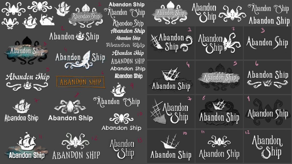
Our first exploration (on the left) immediately hit on some strong elements. We weren’t quite ready to abandon(!) the idea of a ship in distress yet, so we picked what we felt worked and refined these in our second exploration (right).
We quickly started to hone in on some elements that would make it into the final logo. We had concerns over the “ship in distress:” ships with masts and rigging could be messy and hard to read. The ship being at an angle unbalanced the logo, so we discarded this.
We found that the font from the original logo was a strong element and we decided to keep this. By putting the word “Ship” below “Abandon” it resolved the kerning issue and the lines of the A and S drew the eye back into the logo.

When reviewing the latest explorations, a particular image (or variations of it) kept popping out to us, so we took this to the next stage of development.
Already it felt like we’d hit on something stronger than the very first logo and a lot of these passed the “look at it from across the room” test admirably. We tried to inject some painterly, oil-on-canvas stylistic elements but this pulled us away from our goals of a legible, crisp and clear logo so we moved away from this. One aspect we liked about this new logo was that while it gelled collectively, the half-kraken icon and text-only versions worked in a standalone fashion as well.
Fast Start, Slow End
We then embarked upon a long process of Icon, Font and Colour variations. After initially having made such quick progress, it felt strange to spend so much time looking at minute details!
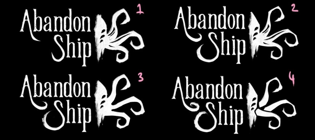
How the A and S were drawn, as well as how the Kraken tentacles looked might seem like minor details, but we felt it was important to get this right.
One area we considered for a while was the use of color. We liked the simple white-on-black scheme but it made the logo feel unfinished. We tried lots of color combinations and variations but we started to go round in circles on this, until we hit on the idea of giving the logo a subtle underwater vibe:
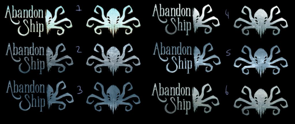
Adding a seabed with caustics, a gradient of light to dark, and a washed out blue (all subtly implemented) really helped make the logo feel dynamic.
With the last selections made we progressed to the final level of detail and we had our new logo:
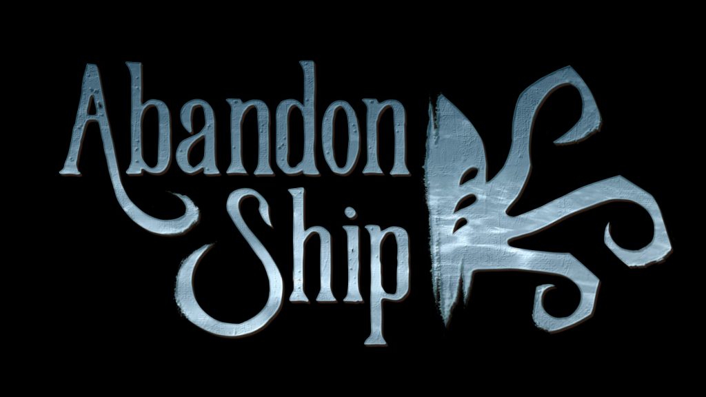
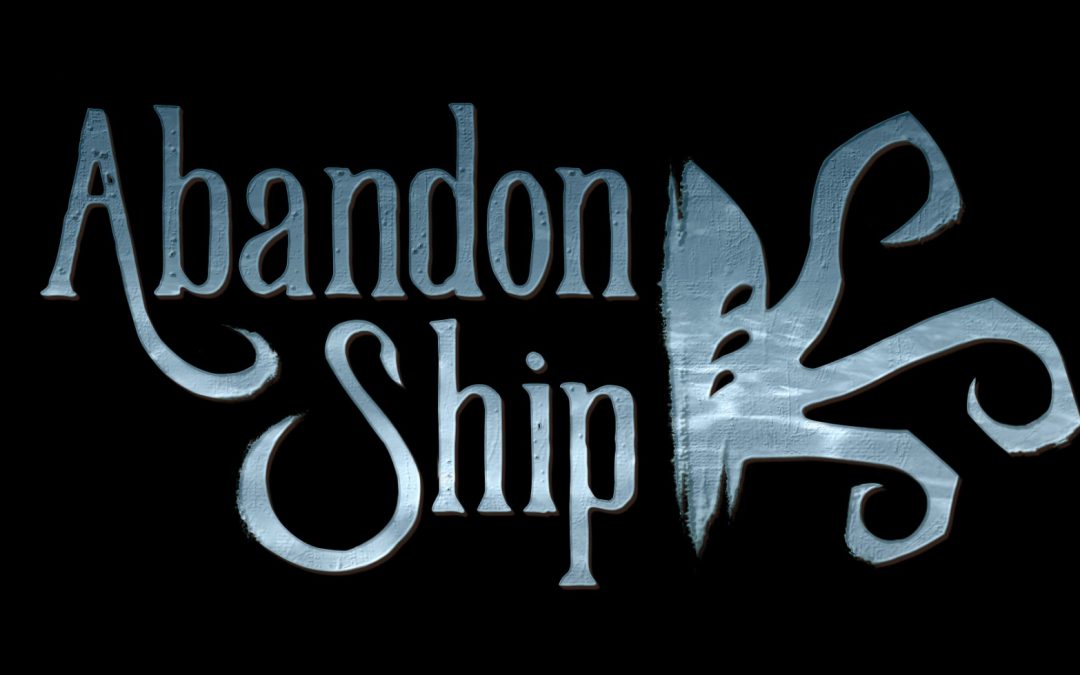
We felt this iteration was much stronger than the original. It is easier to parse. The icon is simple and clearer. There is less clutter. You can make it out from a distance. It has an identity. It feels appropriate to the game. While nothing is ever perfect, it feels right for us.
For anyone embarking upon a logo development process with a similar level of experience as me, my main recommendation is to keep in mind those key lessons at every stage: Keep it clean, legible and simple. Don’t overthink it like I did!

