User interface design is quite a challenging task for game developers. The UI is what a player will refer to for information about the game they are playing and what is happening at every step. Although an interesting point is when it comes to designed menus, particularly the main start menu of a game, some developers seem to completely miss the mark. A menu needs to feel responsive and fluid. If your game’s menus do not feel this way and instead are bland then you leave the player unsatisfied. It’s similar to somebody playing with a toy: sometimes that toy can feel like cheap plastic. That is what a poorly designed menu feels like.

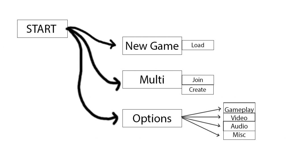
This is a barebones example of a menu presented as a mock flowchart. The idea here is a menu will work in layers that lead to more buttons for various things whether it be different modes, or changing game settings.
Player Events and Tactile Response
Now creating a menu can go one of many ways but the idea is to have menus that work quickly and enable the player to enter the game itself quicker. Another approach would be to create a menu that is heavy with animation and interaction but still is quick and easy to navigate. A menu also needs to feel like it has impact when a player interacts with it, so for example animations need to occur on every user event. These events occur when Idle, when the mouse is over or away from buttons and when a click event occurs.
Feedback is important. It is best to animate every action a player could take within the game. This will vary on what kind of game you are making whether it is a mobile game or a computer game but each action that a player could make needs to be considered. Sometimes buttons are so poorly designed that even animation can fix them this will come down to the core visuals used for the menu.
Visual Design of a Menu
In conjunction with the animation associated to a button or menu item, you need to think about how it will look for the player. Every state of response will need to have different colors and sometimes various sounds—although I won’t be discussing sound design in this article, it is extremely important for your game’s entire UI design.
A shape of a button and where it’s placed on the screen is also important. Having menu items on the left side of a screen then having the next set of items on the right side of the screen really does not bode well for flow. You need to design a menu so that a player can enter the game quickly but also allows for their focus to connect in between button presses and screen changes.
Depending on your art style it may be apt to design your buttons or features of your menu to look 3D or lifted in some manner. This allows for the menu to pop and adds to making navigation easier for the player.

Developers will often add a contextual video to the backdrop of a menu and add what could be classed as widgets to the screen. In Watch Dogs 2, news for the game and events related to it are displayed upon launch.
Fast Steps For Getting Started
- Quick feedback when menu buttons are pressed
- Allowing for quick load times in-between menus
- Easily identifiable buttons (many games have menu items that make navigation convoluted)
- A systematic order to the placement of buttons and items are sorted within the menu
This can include examples like a Press Start Screen, 1st level menu for selecting main features (Single Player, Multi Player, Options and other examples like a Options menu sorted by Sound, Gameplay, Video Settings etc)
Good luck out there!

